iOS Custom Slider Control
The user interface controls can make or break any application. UIControls in an iOS application help the users view and interact within an application. Apple supplies a toolbox with a set of pre-made controls, such as UISlider, UIButton and UISwitch that each have a distinct purpose in an application. Sometimes the pre-existing controls just cannot do what we need out of the box. Sometimes we need to add new functionalities to existing controls by creating a custom control. A custom control class can be difficult at times to create and maintain but it can also be very rewarding. Below we see an image of Apple's stock UISlider control (on the top) and the custom slider control (on the bottom).
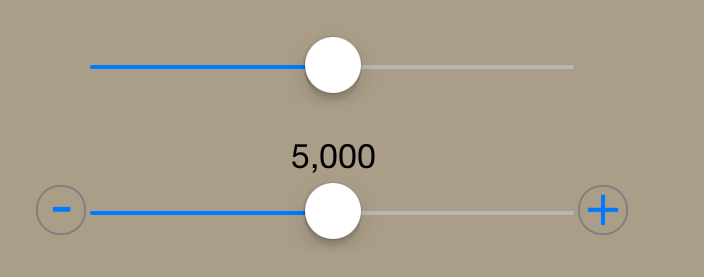
Notice how the custom slider contains two buttons. The button on the left(-) is the decrement button and on the opposite side(+) is the increment button. When one of these buttons are pressed and released the slider value is then incremented or decremented by the custom sliders set increment value. If you were to press and hold one of these buttons then the slider would continuously increase or decrease by the set increment value for the slider. In this demonstration, you will be able to follow along and make your very own custom sider control.
Starting Off
Fire up Xcode. Go to File>New>Project, select the iOS>Application>Single View Application template and click Next. On the next screen, enter the product name, choose your desired Organization Name and Organization Identifier, then make sure that Swift is selected as the language, iPhone is selected as the Device and that Use Core Data is not selected.
Now with you new project open on the left in the Navigator pane you will see files and folders. Go to the folder with the name of you project and right click and choose New File>iOS>Source>Cocoa Touch Class and click Next. For Class enter "myCustomSlider" or whatever you want you slider control to be named. Next we will choose to make this class a Subclass of UISlider so that we can inherit and override methods from the parent. Then click Next and Create.
Then myCustomSlider.swift file is pretty empty but contains the following code
import UIKit

public class myCustomSlider: UISlider {

}
which tells us that are new control "myCustomSlider" inherits from UISlider, which is okay because we want to maintain the basic slider behavior.
Diving in Code First
Below is a clip that shows a Label that can follow the thumb image of the slider and at the same time it displays the current value of that slider.

To get that functionality of your slider working as shown above you must first add the following code to the "myCustomSlider" class.
Adding UILabel to Slider
import UIKit

public class myCustomSlider: UISlider {

    var label: UILabel
    var labelXMin: CGFloat?
    var labelXMax: CGFloat?
    var labelText: ()->String = { "" }

    required public init(coder aDecoder: NSCoder) {
        label = UILabel()
        super.init(coder: aDecoder)
        self.addTarget(self, action: "onValueChanged:", forControlEvents: .ValueChanged)

    }
     func setup(){
        labelXMin = frame.origin.x + 16
        labelXMax = frame.origin.x + self.frame.width - 14
        var labelXOffset: CGFloat = labelXMax! - labelXMin!
        var valueOffset: CGFloat = CGFloat(self.maximumValue - self.minimumValue)
        var valueDifference: CGFloat = CGFloat(self.value - self.minimumValue)
        var valueRatio: CGFloat = CGFloat(valueDifference/valueOffset)
        var labelXPos = CGFloat(labelXOffset*valueRatio + labelXMin!)
        label.frame = CGRectMake(labelXPos,self.frame.origin.y - 25, 200, 25)
        label.text = self.value.description
        self.superview!.addSubview(label)

    }
    func updateLabel(){
        label.text = labelText()
        var labelXOffset: CGFloat = labelXMax! - labelXMin!
        var valueOffset: CGFloat = CGFloat(self.maximumValue - self.minimumValue)
        var valueDifference: CGFloat = CGFloat(self.value - self.minimumValue)
        var valueRatio: CGFloat = CGFloat(valueDifference/valueOffset)
        var labelXPos = CGFloat(labelXOffset*valueRatio + labelXMin!)
        label.frame = CGRectMake(labelXPos - label.frame.width/2,self.frame.origin.y - 25, 200, 25)
        label.textAlignment = NSTextAlignment.Center
        self.superview!.addSubview(label)
    }
    public override func layoutSubviews() {
        labelText = { self.value.description }
        setup()
        updateLabel()
        super.layoutSubviews()
        super.layoutSubviews()
        }
    func onValueChanged(sender: myCustomSlider){
        updateLabel()
    }
    }
Now before we jump into adding buttons on each side of the slider I must go over this code briefly. As shown in the code above I created 4 properties for our custom control class all starting with the word label. The variablelabel is of type object UILabel and the min and max attributes are used to find length and set the position of label. Now labelText syntax might look a little strange but that is just saying when you call labelText() it returns the current value that its set to or it returns "" .
Located in the our custom control initializer function we initialize label by setting it equal to UILabel() before the superview gets initialized. After the superview is initialized we add a target to our control and that sends us to "onValuedChanged:" function for the control event ValueChanged. So whenever the slider value changes it calls that function.
The func setup() simply tells the label where to appear and what to display. The func updateLabel() is used to make sure we have the most updated label including its value, size and position.
By Overriding and adding setup() and updateLabel() to layoutSubviews() allows us to preform more precise layouts of our subviews.
Adding Buttons to Slider
In order to visually add buttons we will need to add certain properties to "myCustomSlider" control class. These properties will include the two UIButtons.
    var decBtn: UIButton?
    var incBtn: UIButton?
We can initialize these buttons by adding the following code to shown below
decBtn = UIButton.buttonWithType(UIButtonType.System) as? UIButton
        decBtn!.setTitle("-", forState: UIControlState.Normal)
        decBtn!.titleLabel!.font = UIFont.systemFontOfSize(30)
        decBtn!.frame = CGRectMake(self.frame.origin.x - 25, self.frame.origin.y+2, 25, 25)

        decBtn!.titleEdgeInsets = UIEdgeInsets(top: -5, left: 0, bottom: 0, right: 0)
        decBtn!.layer.cornerRadius = 12
        decBtn!.layer.borderWidth = 1
        decBtn!.layer.borderColor = UIColor.grayColor().CGColor

self.superview!.addSubview(decBtn!)

incBtn = UIButton.buttonWithType(UIButtonType.System) as? UIButton
        incBtn!.setTitle("+", forState: UIControlState.Normal)
        incBtn!.titleLabel!.font = UIFont.systemFontOfSize(30)
        incBtn!.frame = CGRectMake(self.frame.origin.x + self.frame.width, self.frame.origin.y+2, 25, 25)

        incBtn!.layer.cornerRadius = 12
        incBtn!.layer.borderWidth = 1
        incBtn!.layer.borderColor = UIColor.grayColor().CGColor

self.superview!.addSubview(incBtn!)
to the setup() function inside "myCustomClass". With that code now added our slider should come out looking like the image below.

The button functionality has not been added yet so when you click on either button nothing should change.
Adding Button Increment and Decrement Functionality
First we will need to add a variable to "myCustomSlider" that we want our slider to increment by and we add it using
public var incrementValue: Float = 1.0
Next we create the appropriate actions for the increment and decrement buttons and include them in "myCustomSlider" class object by adding the following functions
    func increment(sender: UIButton){
        var val = self.value
        self.value += Float(incrementValue)
        updateLabel()
    }
    func decrement(sender: UIButton){
        var val = self.value
        self.value -= Float(incrementValue)
        updateLabel()
    }
Now without adding the target to incBtn and decBtn those action functions will never be used. But to connect the buttons to the target action we can add these two lines of code to our setup() function.
decBtn!.addTarget(self, action: "decrement:", forControlEvents: UIControlEvents.TouchDown)
incBtn!.addTarget(self, action: "increment:", forControlEvents: UIControlEvents.TouchDown)
There we have it our own custom slider control. To go about implementing this into your project goto Project Navigator and click Main.storyboard and it should be blank since we have not added anything yet to it.

Then what you are going to want todo is drag a Slider control onto the view from Object Library. Then select the slider already on the view and navigate to Custom Class and select "myCustomSlider" to be this sliders custom class like show below.

Connecting Control to ViewController
Now navigate to the Assistant Editor which is found in the box shown below.

If it does not pop up with the view controller like shown above make sure the Assistant Editor is set to Automatic just like above where the arrow is pointing. Next we need to create an outlet for our control in the view controller so that they are able to communicate with each other. To make this connection hold control key and drag to view controller like shown below.

We have made the connection between the control and the View Controller and now its time to set the min and max values for our slider. We can do this in our ViewController by adding this code
customSlider.minimumValue = 0
customSlider.maximumValue = 10000
customSlider.value = 5000
customSlider.incrementValue = 500
customSlider.value = 5000 is the starting value of our slider and customSlider.incrementValue = 500 is set so that the the buttons will change the slider value by the amount of 500. Now with all that included we can now build and run the project and try out our new custom control.